



This is part two of a two part post on the topic of designing and implementing a new aggregate Ppospect activity report. In part one I touched on planning and designing the report prototype. In part two I will discuss the process I followed for assessing the prototype with stakeholders, then I will briefly move on to report implementation, and, in the final section, I will compare the finished report with the prototype. My hope is that readers will gain insights from my failures and successes should they wish to design a similar report.
Note: Originally I had targeted to have this report complete by spring 2013. Due to a series of reprioritizations and pop-up projects this schedule was revised multiple times. In late summer the project was finally moved down in priority to something along the lines of ‘complete when you can’. As a result, the review process with the prototype took place roughly between April and November of 2014 with implementation following shortly after. Uninterrupted, I estimate a project like this, with 50% dedication by one resource, would take about 2-3 months to complete from start to finish.
Assessment of the Prototype
I presented the prototype for critique to three stakeholder groups as ordered: Advancement Services Research and Relationship Management (RRM); Development Officers; and University Advancement leadership.
RRM are experts in prospect management so naturally I reviewed the prototype with them first. These sessions took place over the course of 4 nonconsecutive days and were between 2 to 3 hours in length. During these sessions I projected a visual of a report section and provided a brief summary of what I was intending to convey with the design and content. We went in-depth with each critique, drilling into things like language and formatting; strength, necessity, and choice of visualizations; accuracy and credibility of underlying data; and target audience. These sessions greatly increased my understanding of the various prospect management processes, such as data entry standards, maintenance frequency, and data ownership.
I had pages of enhancements and changes coming out of the RRM review sessions. Essential changes I completed immediately and less impactful features I delayed for a future release. Afterwards I met separately with four volunteer development officers in one hour sessions. This group had a good range of job experience and data prowess. In these review sessions I handed each volunteer a paper copy of the prototype, filtered to their specific activity, and observed them as they navigated through the report. I wanted to record their initial reactions in order to surface sections that were unclear, subject to incorrect interpretations, or that were perhaps too dense for the less data-inclined.
Every development officer that I sat with mentioned that the aggregate sections at the start of the report were interesting but not something they needed to see often. They were, however, really excited about the Pipeline Management portion of the report, which has a list format and is largely workflow in nature. I made several additions and enhancements to the Pipeline Management section as a result. There were other text and formatting related changes that I completed at this time.
Lastly I reviewed the prototype with Advancement leadership, that is, the people who would use the report directly as well as manage the staff who would use the report. The RRM Director accompanied me. This review session was performed over the course of one hour and I provided the prototype in advance for their review. I followed a presentation format and the main objective here was to gain approval and sign-off. There were many questions during the review session, but ultimately the feedback was positive and the approvals came with only a minimum of changes to the report.
Implementation
Implementation included a 20-minute presentation to University Advancement staff followed up by an email that included the report user guide. As part of implementation I gave staff the opportunity to name the report. Staff members proposed titles and then had the opportunity to vote. The winner: the ‘360 Prospect Management Report’. Granted it is not the name that I would have chosen, but it seemed to really connect with staff in a way that something like ‘Aggregate Prospect Activity Report’ never could.
As part of implementation the RRM Director and I offered one-on-one sessions with development officers in order to walk them through their version of the report. Though there was a lot of excitement during the presentation of the report, adoption by users has been slow. Talking with staff, the delay is mainly a result of lack of time rather than lack of interest.
Comparison of Prototype to Final
Note that report header, footer, and PSU logo are present in the actual report but are cut from the below examples. The report also includes a table of contents section at the start and a Criteria definitions section at the end, neither of which are shown here. Numbers provided in these examples are artificial and thus data may contradict other data on the slide and percentages in graphs/tables may not sum up to 100%. In each section, the prototype is shown on the left with a gray border and the final is shown on the right with a dark green border.
The report can be run on-demand through our prospect management application and includes parameters that allow it to be cut by manager or unit; campaign; and prospect stage. Users can also choose to only run certain sections. Data in report is compiled real-time from a mix of production and reporting tables and the full report (approx. 100 pages) takes about 50 seconds to execute. I built the report within Crystal Reports and it is made up of 1 main report that calls 13 sub reports, each joined by the aforementioned parameters. I wrote custom SQL for each sub-report as opposed to building it within Crystal as table joins. The report exports in PDF format.
As a whole, graphs favor a simple bar chart design and color is used sparingly with favor given to gray tones. Graphs are used to facilitate comparisons and tables are used when concrete data points are required. Data dense graphs would be a bit too much for the target audience of this report. Where possible I follow the design principles for presenting quantitative information as laid out by Stephen Few.
Portfolio Composition
Prototype vs Final
PURPOSE
To give a view of quality and penetration of current assigned prospects. Quality measures include capacity, value, and affinity. Penetration measures include yield. A similar Assignment Pending slide is available if unfiltered or if filtered by unit
COMPARISON TO PROTOTYPE
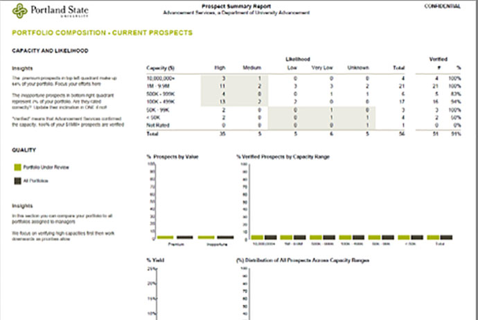
Visually, the main difference between versions is the change to quadrant coloring in the capacity/affinity table. The orange quadrant contains hot prospects (those of high capacity and affinity) and the blue quadrant contains cool prospects (those with high capacity and low affinity). A new insight recommends developing strategies to convert cool to hot by increasing affinity in prospects. RRM decided that most users wouldn’t care about ‘% verified’, so that was replaced by a basic percent distribution. Other changes included limiting the bar charts to rated prospects, adding a definition of ‘Yield’, and combining the <$50K capacity range with the 50K-99K range within the table and charts.
Likelihood was discarded and instead I have included affinity as a breakout in the capacity table. I proposed the concept of ‘likelihood’ in the prototype as a modified affinity based on development officer feedback. RRM decided against this idea, primarily because we wouldn’t have the staff available to monitor if the derived likelihood was actually indicative of likelihood to give. Aside from that, affinity isn’t a measurement of likelihood to give; rather, it is an estimate of the degree to which the prospect values PSU. So using affinity in this ways was incorrect to start. Above that, some users already have low confidence in our affinity scores and we are currently seeking to replace affinity with a different measure.
Portfolio Stage Activity
Prototype vs Final
PURPOSE
Presents actual and planned activity for each stage of the development officer’s portfolio. The table includes unique visit and unique move metrics. Insights and graphs incorporate comparisons against all assigned prospects. Work on this page included building new backend tables for tracking historic changes in stage and manager assignment.
COMPARISON TO PROTOTYPE
This slide saw a large amount of changes following the RRM review. In the table, move breakouts were changed from 1+, 2+, and 3+ cumulative percentages to distinct 1 move, 2 move, and 3+ move buckets. A ‘No Move’ bucket was added so that percentages would sum to 100%. Most people were confused by the cumulative move breakouts and would attempt to sum the cumulative 1+, 2+, and 3+ percentages together, which inevitably would yield a number greater than 100%.
The graphs trending stage changes by month were completely removed. I was concerned that these were too busy and the review sessions confirmed this. In addition, RRM advised that stage proportions didn’t change drastically for a development officer over the course of a year so the 12-month trend would likely convey little meaningful information, at least at the manager level. I will be revisiting this for the second release to see if it is meaningful to include when the report is not filtered by manager. The final report collapses all stages and shows total moves through any stage by month. It also includes time in stage from a median and maximum standpoint with comparisons to all current prospects at PSU.
Prototype vs Final
PURPOSE
Presents meaningful contact activity (visits, moves, discovery qualifications) over time. Bars track activity over the last 12 months. The table is used for reporting various time periods that are not equal in length (fiscal year to date, last 12 months, and entire fiscal year). Insights compare activity to goal.
COMPARISON TO PROTOTYPE
RRM thought it would be more useful if the stacked bars gave a sense of contacts by stage at time of contact whereas in the prototype the stacked bars represented unique contacts versus repeated contacts. I was concerned that stacking by stage would result in a busy presentation but keeping the colors limited to gray tones keeps the chaos at a minimum. As with any stacked graph, one can only make out general patterns. Exact comparison between bars is not possible, at least at the stage level.
The insights were changed from comparison-to-whole to comparison-to-goal. Given that some development officers work part-time or have different expectations towards their contact activity (e.g. they are not expected to do many discovery evaluations), this change makes for a more relevant message.